IoTで使うPython入門 Step4-Python3ソケット④DMM 34461Aグラフ
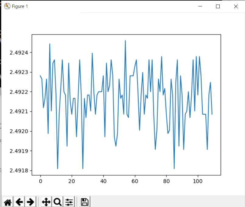
前回、DMMが測定した直流電圧値を連続してPCに転送できました。取り込んだデータはリスト形式の数値です。このデータをグラフにします。
●使うライブラリはmatplotlib
コマンドプロンプトを立ち上げます。筆者のPython3はpyで起動し、現在、3.8.1がインストールされています。
pip3 install matplotlib
で、ライブラリmatplotlibをインストールします。確認します。
pip3 list
●前回のデータを使う
測定したデータから110個のリストをコピーしてきます。y軸のデータとして利用します。
from matplotlib import pyplot as plt

x = list(range(0,110))
y = [2.49228088, 2.49226412, 2.49211868, 2.49216626, 2.49226412, 2.4919873, 2.49244309, 2.49210192, 2.49234522, 2.49236198, 2.49218302, 2.49180833, 2.49208516, 2.49221654, 2.49236198, 2.49219978, 2.49218302, 2.49192295, 2.49234522, 2.4921495, 2.49208516, 2.49216626, 2.49216626, 2.49197054, 2.49216626, 2.49236198, 2.49218302, 2.49180833, 2.49216626, 2.4920684, 2.49218302, 2.49218302, 2.49210192, 2.4923955, 2.49219978, 2.49208516, 2.49218302, 2.49219978, 2.49219978, 2.49219978, 2.49228088, 2.49197054, 2.49234522, 2.49219978, 2.4922306, 2.49236198, 2.49228088, 2.49197054, 2.49192295, 2.4919873, 2.49226412, 2.49216626, 2.49218302, 2.49208516, 2.49245985, 2.49208516, 2.4920684, 2.49228088, 2.49228088, 2.49228088, 2.49232846, 2.49236198, 2.49219978, 2.49200406, 2.49218302, 2.49229764, 2.49208516, 2.49218302, 2.49216626, 2.49236198, 2.49219978, 2.49236198, 2.49208516, 2.49190619, 2.49200406, 2.49226412, 2.49219978, 2.49237874, 2.49218302, 2.49221654, 2.49208516, 2.4919873, 2.49200406, 2.49226412, 2.49218302, 2.49180833, 2.49224736, 2.49236198, 2.49192295, 2.49228088, 2.49218302, 2.49190619, 2.49208516, 2.49210192, 2.49219978, 2.4920684, 2.49218302, 2.49236198, 2.49210192, 2.49237874, 2.49218302, 2.49237874, 2.49228088, 2.49208516, 2.49208516, 2.49208516, 2.49190619, 2.49218302, 2.49224736, 2.49208516]

plt.plot(x, y)
plt.show()
plot1.pyで保存します。
py plot1.py
で実行します。
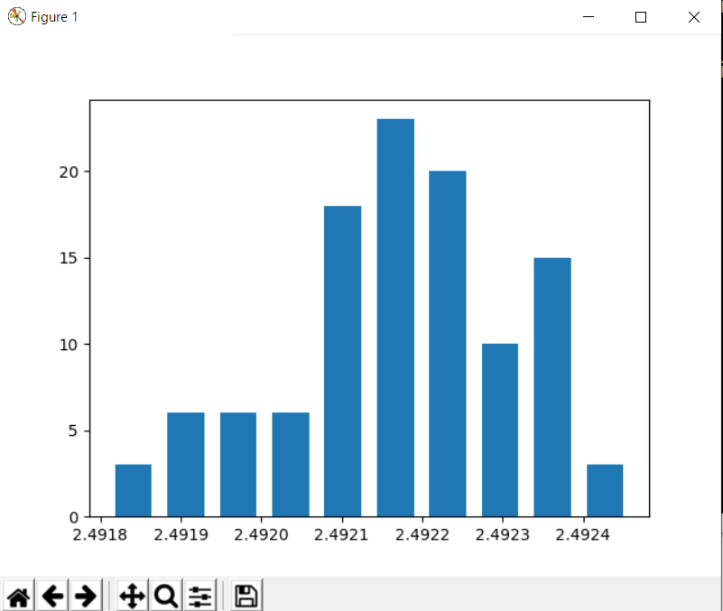
●最頻度グラフ
同じデータを使って、DUTの電圧源の安定度をみます。電圧源は、TL431を使った基準電源です。
import matplotlib.pyplot as plt

data = [2.49228088, 2.49226412, 2.49211868, 2.49216626, 2.49226412, 2.4919873, 2.49244309, 2.49210192, 2.49234522, 2.49236198, 2.49218302, 2.49180833, 2.49208516, 2.49221654, 2.49236198, 2.49219978, 2.49218302, 2.49192295, 2.49234522, 2.4921495, 2.49208516, 2.49216626, 2.49216626, 2.49197054, 2.49216626, 2.49236198, 2.49218302, 2.49180833, 2.49216626, 2.4920684, 2.49218302, 2.49218302, 2.49210192, 2.4923955, 2.49219978, 2.49208516, 2.49218302, 2.49219978, 2.49219978, 2.49219978, 2.49228088, 2.49197054, 2.49234522, 2.49219978, 2.4922306, 2.49236198, 2.49228088, 2.49197054, 2.49192295, 2.4919873, 2.49226412, 2.49216626, 2.49218302, 2.49208516, 2.49245985, 2.49208516, 2.4920684, 2.49228088, 2.49228088, 2.49228088, 2.49232846, 2.49236198, 2.49219978, 2.49200406, 2.49218302, 2.49229764, 2.49208516, 2.49218302, 2.49216626, 2.49236198, 2.49219978, 2.49236198, 2.49208516, 2.49190619, 2.49200406, 2.49226412, 2.49219978, 2.49237874, 2.49218302, 2.49221654, 2.49208516, 2.4919873, 2.49200406, 2.49226412, 2.49218302, 2.49180833, 2.49224736, 2.49236198, 2.49192295, 2.49228088, 2.49218302, 2.49190619, 2.49208516, 2.49210192, 2.49219978, 2.4920684, 2.49218302, 2.49236198, 2.49210192, 2.49237874, 2.49218302, 2.49237874, 2.49228088, 2.49208516, 2.49208516, 2.49208516, 2.49190619, 2.49218302, 2.49224736, 2.49208516]

plt.hist(data, rwidth=0.7)
plt.show()
実行します。きれいなガウス分布ではありませんが、どの値に測定値が集中しているかがわかります。
●オシロスコープのような動的な表示
時間軸が数msに設定したオシロスコープのような表示をします。matplotlibのGalleryにあるOscilloscopeを修正しました。matplotlib.animationの機能と、subplots()の組み合わせで実現しています。
from matplotlib.lines import Line2D
import matplotlib.pyplot as plt
import matplotlib.animation as animation

data = [2.49228088, 2.49226412, 2.49211868, 2.49216626, 2.49226412, 2.4919873, 2.49244309, 2.49210192, 2.49234522, 2.49236198, 2.49218302, 2.49180833, 2.49208516, 2.49221654, 2.49236198, 2.49219978, 2.49218302, 2.49192295, 2.49234522, 2.4921495, 2.49208516, 2.49216626, 2.49216626, 2.49197054, 2.49216626, 2.49236198, 2.49218302, 2.49180833, 2.49216626, 2.4920684, 2.49218302, 2.49218302, 2.49210192, 2.4923955, 2.49219978, 2.49208516, 2.49218302, 2.49219978, 2.49219978, 2.49219978, 2.49228088, 2.49197054, 2.49234522, 2.49219978, 2.4922306, 2.49236198, 2.49228088, 2.49197054, 2.49192295, 2.4919873, 2.49226412, 2.49216626, 2.49218302, 2.49208516, 2.49245985, 2.49208516, 2.4920684, 2.49228088, 2.49228088, 2.49228088, 2.49232846, 2.49236198, 2.49219978, 2.49200406, 2.49218302, 2.49229764, 2.49208516, 2.49218302, 2.49216626, 2.49236198, 2.49219978, 2.49236198, 2.49208516, 2.49190619, 2.49200406, 2.49226412, 2.49219978, 2.49237874, 2.49218302, 2.49221654, 2.49208516, 2.4919873, 2.49200406, 2.49226412, 2.49218302, 2.49180833, 2.49224736, 2.49236198, 2.49192295, 2.49228088, 2.49218302, 2.49190619, 2.49208516, 2.49210192, 2.49219978, 2.4920684, 2.49218302, 2.49236198, 2.49210192, 2.49237874, 2.49218302, 2.49237874, 2.49228088, 2.49208516, 2.49208516, 2.49208516, 2.49190619, 2.49218302, 2.49224736, 2.49208516]


class Scope:
    def __init__(self, ax, maxt=10, dt=0.2):
        self.ax = ax
        self.dt = dt
        self.maxt = maxt
        self.tdata = [0]
        self.ydata = [2.49]
        self.line = Line2D(self.tdata, self.ydata)
        self.ax.add_line(self.line)
        self.ax.set_ylim(2.49, 2.495)
        self.ax.set_xlim(0, self.maxt)

    def update(self, i):
        lastt = self.tdata[-1]
        if lastt > self.tdata[0] + self.maxt:  # reset the arrays
            print('reset time(xscale)')
            self.tdata = [self.tdata[-1]]
            self.ydata = [self.ydata[-1]]
            self.ax.set_xlim(self.tdata[0], self.tdata[0] + self.maxt)
            self.ax.figure.canvas.draw()

        t = self.tdata[-1] + self.dt
        self.tdata.append(t)
        #print(data)
        self.ydata.append(data[i])
        #print('tdata ', self.tdata[i] , 'ydata ', self.ydata[i])
        self.line.set_data(self.tdata, self.ydata)
        #self.plt.grid()
        return self.line,


fig, ax = plt.subplots()
scope = Scope(ax)

ani = animation.FuncAnimation(fig, scope.update, interval=10, blit=True)

plt.show()
#w = animation.PillowWriter(fps=20)
#ani.save('animation_test.gif', writer=w)
プログラムの最下行付近にあるplt.show()をコメントアウトし、最後の2行を生かすと、次のようなgifァイルが得られます。
